
Project Links:
Problem summary:
Many of the same advances that have brought about the “big data” revolution
in quantitative data have also caused dramatic growth in the availability of
qualitative data.
in quantitative data have also caused dramatic growth in the availability of
qualitative data.
Qualitative data does not lend itself well to the same sorts of automated summary and abstraction tools that work with quantitative data. This means that many researchers are often drowning in qualitative data without advanced analytic tools.
Role:
Designer and developer
Collaborator and advisor:
Prof. Kim Erwin
Key insights:
1. Qualitative data can be understood in a rapid, precognitive manner when presented visually.
2. The ability to quickly explore data in context and in a unified environment provides critical value for to the sense-making process for qualitative data.
3. Data visualization can work like a prototyping process and provide value early in the analysis process, with value increasing with faster iterations and lower costs to change.
4. Tools must not only integrate into a users’ workflow but they must also respect their contexts of use and of the data entrusted to them.
Design principles:
1. Allow exploration of data at multiple levels of abstraction.
2.Help enable pattern spotting using visuospatial processing abilities.
3. Allow analysis to be treated more like prototyping – produced quickly, at little cost, evaluated and refined (or abandoned if not useful).
4. Keep data safe by keeping data local.
Awards & Recognition:
2015 Knight Foundation Prototype Fund Award – provided funding for complete rewrite, no-upload design and additional analytical features.
2013 Ethnographic Praxis in Industry Conference Accepted Paper & Talk: Small Packages for Big (Qualitative Data) – Nineteen was a key example of the concept of using small, flexible tools to build powerful toolchains that fit the needs of researchers, rather than dictating workflows.
Current status:
Nineteen remains online, free to use and open-sourced.
Available at http://usenineteen.com
Design concept:
Nineteen is a freely available tool that allows rapid visualization and exploration of qualitative data at multiple levels of abstraction, simultaneously. Designed for use early in analysis, nineteen fosters hypothesis testing, aiming to prompt as many questions as it answers.

A lot of research data ends up in excel files, looking much like the one above – an undifferentiated sea of gray. While excel lends itself well to the bite-sized chunks of text and links to images that online survey and "net-ethnography" tools produce, it fails to make it easy to browse, search or spot patterns in one's data.

Visualization courtesy of Professor Kim Erwin, IIT Institute of Design
If one works for a while, that data can be converted into visualizations like the one above. However, often that work has a significant amount of manual labor included and it usually makes it difficult to see the data in the raw, original context. This makes it all but impossible to re-examine, recode or ask new questions of one's data.
Instead, what if we could produce visualizations that were based directly on the .xlsx file and build them almost instantaneously? Further, what if we were able to link that back to the raw text and image data?

An early, clickable prototype, made in OmniGraffle and used for initial concept evaluation and testing
The product of our first iteration was a clickable prototype that showed the data at three levels of abstraction with the most concrete, spreadsheet view at the bottom, the most abstracted visualization in the center and a abstracted, detailed view on the right.
Quick usability testing showed that the spreadsheet view added little value and so it was eliminated in subsequent revisions. After a series of additional prototypes, we have released a working development version at http://data.pollari.org, with screenshots shown, below:
First publicly available tool

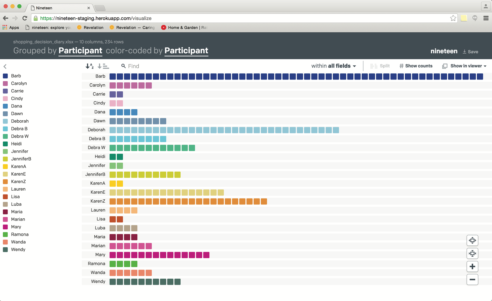
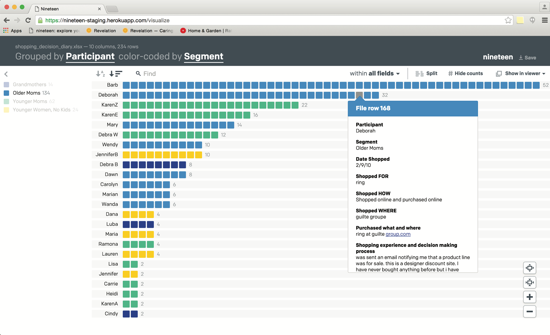
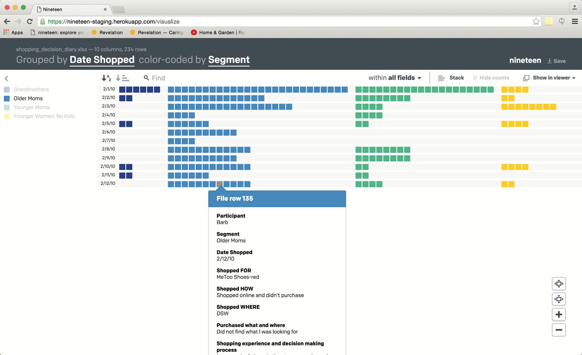
Simple and quick visualizations like the above are generated automatically from .xslx files. Each cell in the visualization is a row in the Excel file and nineteen automatically finds the groupings of values by column and allows sorting and coloring by any of the variables/columns in the file.

Mousing over any of the cells in the visualization brings up a user-configurable pop-up and detailed view which includes any images linked to in the data as well, allowing a rich view of mixed media datasets.
2015 Knight Foundation Prototype Fund Sponsored Updates
Complete rewrite and updated UI with consumer-research driven feature revisions:
– Improved UI, including enhanced grouping/visual splitting and searching
– text analysis: high frequency word search
– downloadable Nineteen (HTML version) for saving/sharing
Improved UI retains many of the original characteristics while enabling richer exploration of the dataset
Enhanced splitting view allows for easier comparisons across groups/rows
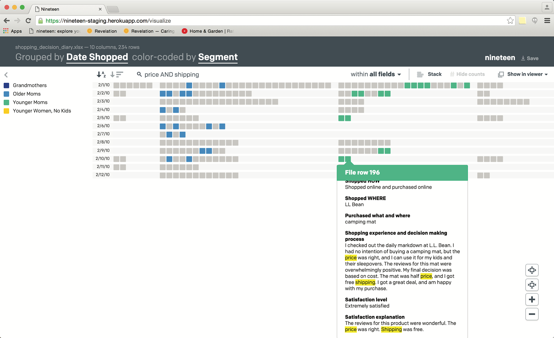
Improved search functionality adds boolean operators and contextual highlighting
Additional information:
Demo video: https://vimeo.com/44337905
Kim Erwin’s IASDR2011 paper on this and related work:
http://www.id.iit.edu/media/cms_page_media/38/9-VisualCodingOfQualitativeData-Erwin.pdf
http://www.id.iit.edu/media/cms_page_media/38/9-VisualCodingOfQualitativeData-Erwin.pdf